Render & Slate
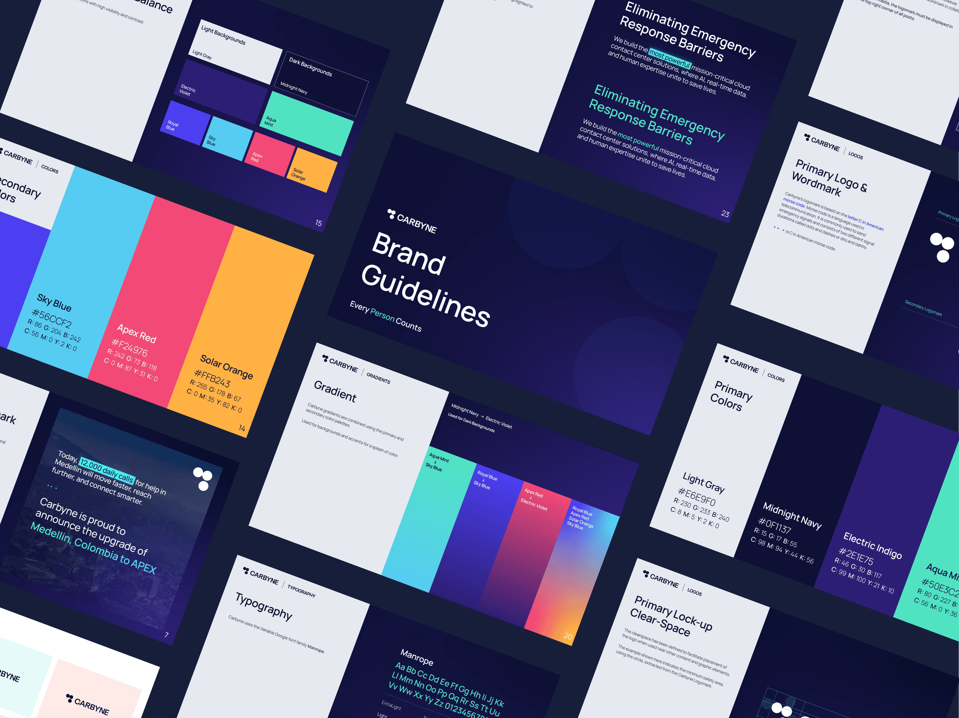
When I took on the Carbyne rebrand, the visual identity was fragmented — a mix of three competing styles that lacked cohesion and clarity. Across different platforms and touchpoints, the brand felt disjointed, making it difficult to establish a strong presence or consistent message.
Client:
Carbyne
My Role:
Design Lead
Year:
2025
Service Provided:
Brand Design, Art Direction

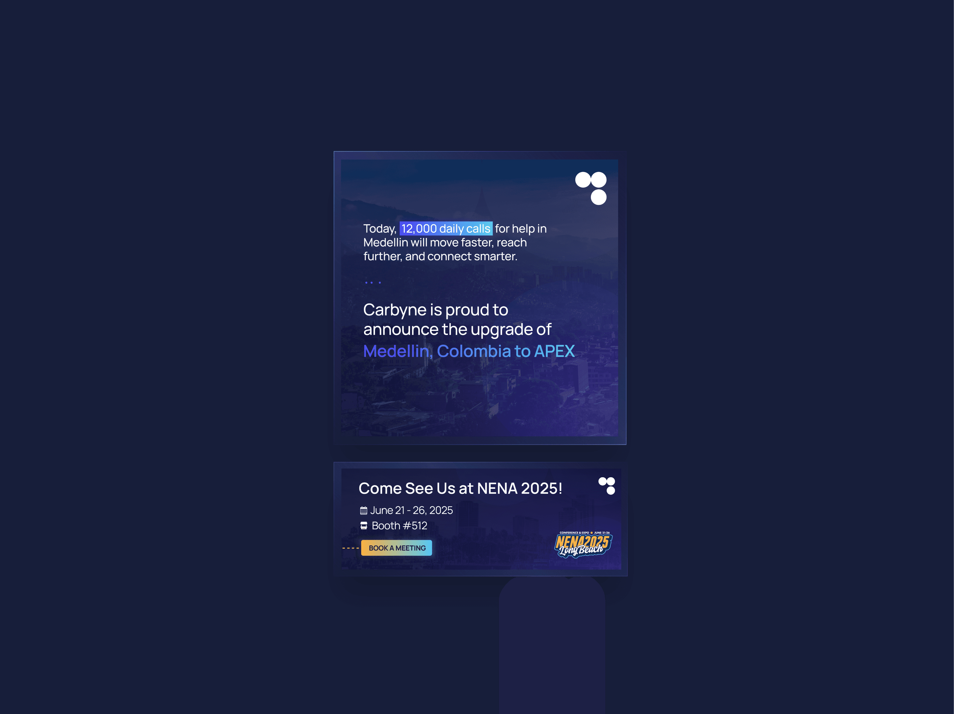
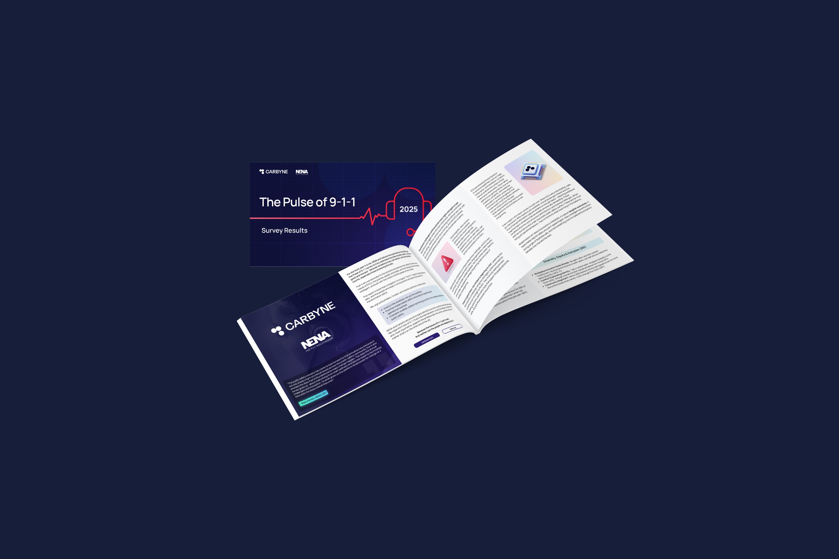
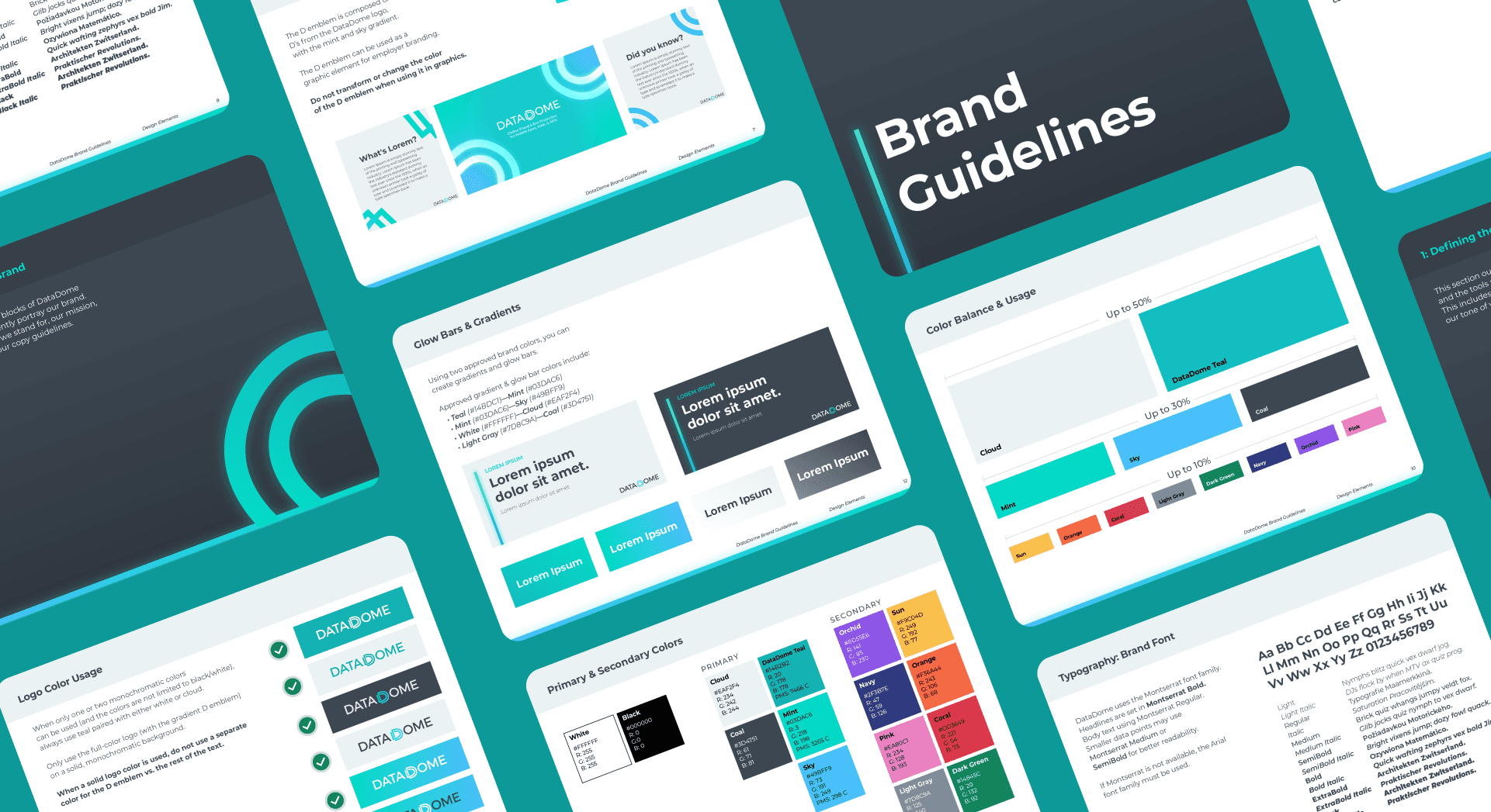
My goal was to bring visual harmony, accessibility, and modernity to the forefront. I developed a new, unified brand system anchored by a versatile color palette that meets both AA and AAA WCAG accessibility standards. These colors were carefully chosen to maintain readability and contrast across both light and dark modes, ensuring the brand performs just as well in a product UI as it does in a marketing asset.
The previous brand suffered from low contrast, limited color variance, and typography that didn’t hold up under different conditions. The new direction introduced balance, clarity, and a scalable design system that elevates Carbyne’s identity while maintaining functional integrity — especially in high-stakes, mission-critical environments.